2016 gets underway and we are already looking to the future of web design. What New trends that will dominate the industry? Finally the rest will be established?
Web design is an industry changing rapidly moving and where trends come and go over time. Some of the trends in web design are as a result of improvements to performance and speed, and improving the user experience.
Let’s look through some of the trends we can expect to see more of this year.
- CSS3 Animations
Browser support for CSS3 has been growing over the past couple of years, and we’re finally reaching a stage where some of the fancy new CSS3 layout modules can be safely used in our websites.
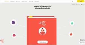
Animated user interface elements are a fun way to help engage users, give them something while they wait for content to load and provide an element of surprise. Moving elements are everywhere. And they will continue to grow in popularity with in the coming year.
Source Credit: hell-o-baby.com
- Long Scrolling and Vertical Patterns
As the mobile web continues to grow and web design continues to skew in the direction of a more effective and enjoyable mobile experience, scrolling will continue to dominate clicking.
With smaller screens and super natural touch scrolling movement, people prefer to scroll around instead of clicking on the links and waiting for the content to appear.
A bigger leaning toward mobile – with some thinking mobile traffic could equal desktop traffic this year – means more sites are being designed with vertical user flows.
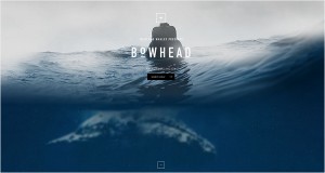
Source Credit: Tailsandwhales
- Material Design: A Richer Alternative to Flat Design
Google Material Design well represents the metaphor of the material world with the clever play of shadows, light and movement gives users visual clues of their interaction with a website.
There has been a bit of a revolution over last year in the form of the adoption of Google’s Material design as a basis for UI presentation and development. This trend reflects the move toward smartphones as the principle and first device used to access the web, over and above the desktop or laptop computer.
The popularity of Google Material Design philosophy is being embraced by many designers and developers that lead to cleaner and more organized digital products. Research conducted by Usabilla shows that web designers are in favor of the flat design movement.
Material Design has boomed in 2015 and will continue to go strong in 2016. It’s the perfect style for Responsive Web Design.
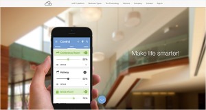
Source Credit: Nimbusnine
- Card Style Interfaces
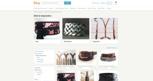
We see “Card” design in everywhere from apps to websites to printed pieces. Now it has proven to be a great tool for designers working on responsive websites. Since they act as “content containers”, their rectangular shape makes them easier to re-arrange for different device breakpoints.
In short, cards are clean and simple with a lot of versatility. Exactly what the web needs. So expect to see more of it in the remainder of 2015 and throughout 2016.
Source Credit: Etsy
- Responsive Design
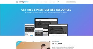
Responsive web design has become incredibly popular in recent years. The responsive or mobile-friendly version of your website can easily double your traffic as people will be empowered to access your website any time anywhere.
Performance is important not only to UX, but also to Google in the wake of the Mobile Friendly update which released in April 2015. Responsive design has solidified itself as the new standard for web design in general and WordPress themes in particular.
It’s safe to say responsive design isn’t going anywhere soon, as it represents a relatively simple and cheap way for businesses to build a fully-functional mobile-friendly site.
Source Credit: TrendyTheme
- Full-Screen Videos
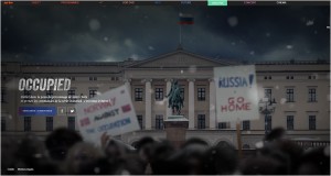
Web sites generally are storytelling tools and storytelling can be more effective when visuals and motion are involved so the ideas and emotions can be transferred to the visitor easier. We’ve seen businesses implementing video in their websites.
In 2016, this trend will grow even more with the endless possibilities of 3D graphics and HD quality videos to build that impression of real life experience.
Source Credit: Occupied.arte.tv
- Illustrations and Sketches
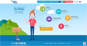
Since vision is the strongest human sense, Illustrations and Sketches are the fastest ways to grab a user’s attention. The illustration style has also started to grow in popularity when it comes to some of the smaller pieces of website design as well, such as icons and other user interface elements.
What’s nice about this trend is that illustrations make a site feel a little more personal. Because an illustration or sketch style icon appears to be hand-drawn, it looks and feels personal for users that can go a long way into creating a connection with them.
We’re expecting this to be in the form of illustration over photography, because with illustration it’s often easier to place yourself.
Source Credit: Travellingtoperu
- Focus on Interactions
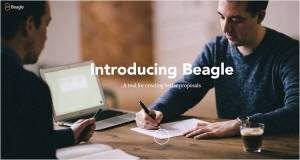
Interactions create links between users and devices. It also increase user engagement with content. Good interactions are often small – even micro in nature – and provide value and new experiences to the user.
So we think this trend will grow even more in this year.
Source Credit: Getbeagle.co
- Even More Beautiful Typography
The past couple of years has seen a total transformation in the typographical landscape online as web fonts have become accessible to all, and as a result, we’ve already seen a dramatic shift in the way type is rendered online.
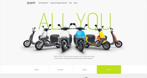
Big, bold typefaces will continue to rule because they work well with other trendy elements. This simple concept of lettering gives more room to other elements while communicating the message with a highly readable display. The must-try trick is a simple pairing of a readable typeface and fun novelty option.
Source Credit: Gogoro
- Bolder, Brighter Color
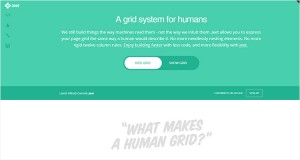
Big, the bright color really started to emerge with the flat design trend and has continued to gain momentum. Google’s Material Design documentation furthers that conversation. And just take a look around Dribble, where color is everywhere. These are key indicators that color will stay big in the coming year.
Source Credit: Jeet
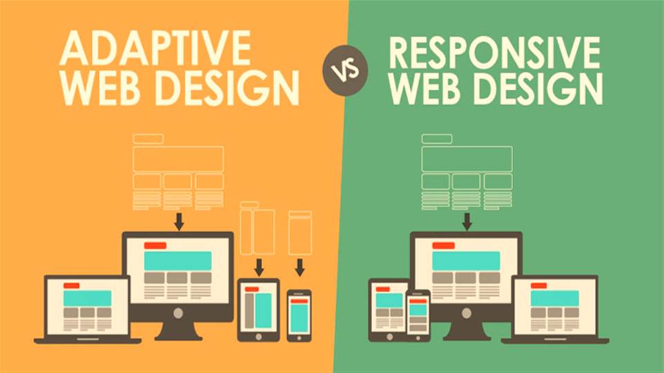
Responsive Design vs. Adaptive Design: What’s the Best Choice for Designers?

